Introducing LogicMonitor’s New UI


Proactively manage modern hybrid environments with predictive insights, intelligent automation, and full-stack observability.
Explore solutionsExplore our resource library for IT pros. Get expert guides, observability strategies, and real-world insights to power smarter, AI-driven operations.
Explore resourcesOur observability platform proactively delivers the insights and automation CIOs need to accelerate innovation.
About LogicMonitor
Get the latest blogs, whitepapers, eGuides, and more straight into your inbox.
Your video will begin shortly
After joining the product management team at LogicMonitor – I was instantly drawn toward pushing improvements to our user interface (UI). After years of growth and agile development LogicMonitor’s UI had taken a toll, a common challenge across rapidly growing software companies. But where do we start and how do we make improvements that streamline workflows and increase productivity for our users?
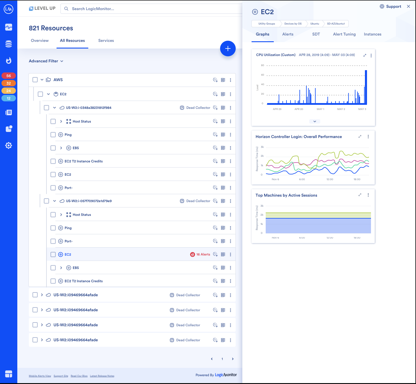
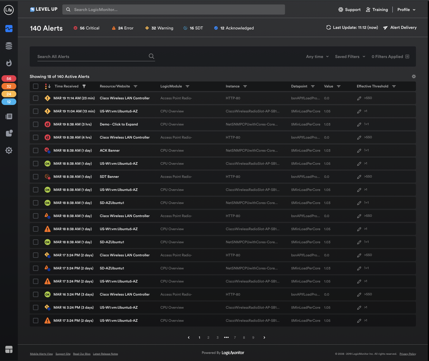
LogicMonitor was able to conduct extensive research on the user experience and found two major improvements to focus on: reducing clicks and making core platform functionalities easier to access. And with that we are excited to introduce LogicMonitor’s improved user interface. The new interface will make completing tasks in LogicMonitor faster by requiring less clicks and making navigation more intuitive.
Along with extensive research driving improvements, LogicMonitor is also leveraging React and Material Design to guide and implement improvements.
React is a JavaScript library that offers a variety of benefits including faster agile development and a more responsive user interface. React also allows for easier implementation of functionality that would’ve otherwise been more cumbersome to accomplish on the front-end, such as dark mode. This means updates and improvements can be pushed out faster to the broader UI.
Material Design is a visual language created by Google that synthesizes the classical principles of good design with the innovation and possibilities of technology and science. Material Design is simple, intuitive, and present in everyday apps you may already be familiar with like Gmail, Google Calendar, and Google Maps. It is extremely comprehensive, gets updated on a regular basis and essentially, is a product in itself. And most importantly it allows for a single underlying system that unifies the user experience across platforms and devices.
In ITOps when alerts are firing or an outage is imminent and you’re on call, every second and click counts. LogicMonitor kept this at the forefront of design efforts and understands that consistency across interfaces increases familiarity and reduces lead time to resolution. The combination of the two tools outlined above (React and Material Design) allows us to build a solid foundation for us to create, deliver, iterate on feedback and repeat. As we continue to grow there are more plans to insure that we are offering a product that not only offers the best monitoring coverage across your infrastructure but is also easy to use.
The new UI will be rolled out on a page-by-page basis and will be available within the product as soon as they are ready to go live. In the meantime, if you are interested in learning more about how LogicMonitor can help streamline your workflow reach out for a free trial or attend one of our weekly demos.
© LogicMonitor 2025 | All rights reserved. | All trademarks, trade names, service marks, and logos referenced herein belong to their respective companies.
Blogs
Explore guides, blogs, and best practices for maximizing performance, reducing downtime, and evolving your observability strategy.


