LogicMonitor’s New UI: Alerts Page

LogicMonitor + Catchpoint: Enter the New Era of Autonomous IT

Proactively manage modern hybrid environments with predictive insights, intelligent automation, and full-stack observability.
Explore solutionsExplore our resource library for IT pros. Get expert guides, observability strategies, and real-world insights to power smarter, AI-driven operations.
Explore resources
Our observability platform proactively delivers the insights and automation CIOs need to accelerate innovation.
About LogicMonitor
Get the latest blogs, whitepapers, eGuides, and more straight into your inbox.
Your video will begin shortly
As discussed in a previous blog, here at LogicMonitor, we are in the process of rolling out a new user interface (UI) which is designed to streamline workflows, reduce clicks, and include powerful new features.
So what’s new in the alerts page?
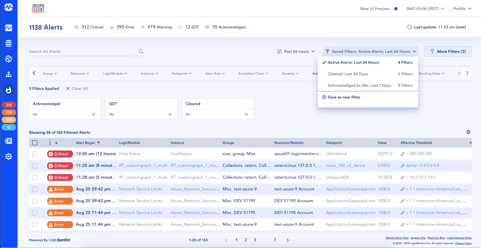
One of the highlights of the new alerts page is the ability for users to create a set of filters, save them, give them a name that resonates with their team and quickly and easily access them at a later time. In addition, the ability to filter the alerts table based on the time at which an alert began is also new. Out-of-the-box, a number of saved filters have already been preconfigured to help get you started, however, what we are most interested in seeing are the unique combinations you create that increase efficiency and make the most sense to you and your team.
As a daily user, the first thing I may do is come into the alerts page and access my “active alerts only” saved filter, which is showing only alerts that are not in SDT, have not yet been acknowledged, and have not cleared. What used to take 15 clicks to hide these 3 fields from my view, now only takes 2. So if this is something you have to do multiple times a day, this definitely saves you some clicks throughout your work week.
Or perhaps you work within a large enterprise environment with multiple teams that deal with different types of alerts. Now you can create a saved filter based on an escalation chain that only shows alerts that are delivered to your server team… or if your company organizes your infrastructure based on grouped locations, you can create a set of saved filters that shows only alerts originating from the Western hemisphere.
Along the subheader of the new alerts page, a count has been added to show the total number of active alerts, as well as their breakdown by alert severity, SDT status, and acknowledgment state. When clicked, these numbers act as quick filters and by clicking on the total number of alerts the table will sort with the most recent and most severe alerts first.
Another net-new feature on the alerts page is the ability to perform a bulk scheduled downtime (SDT).
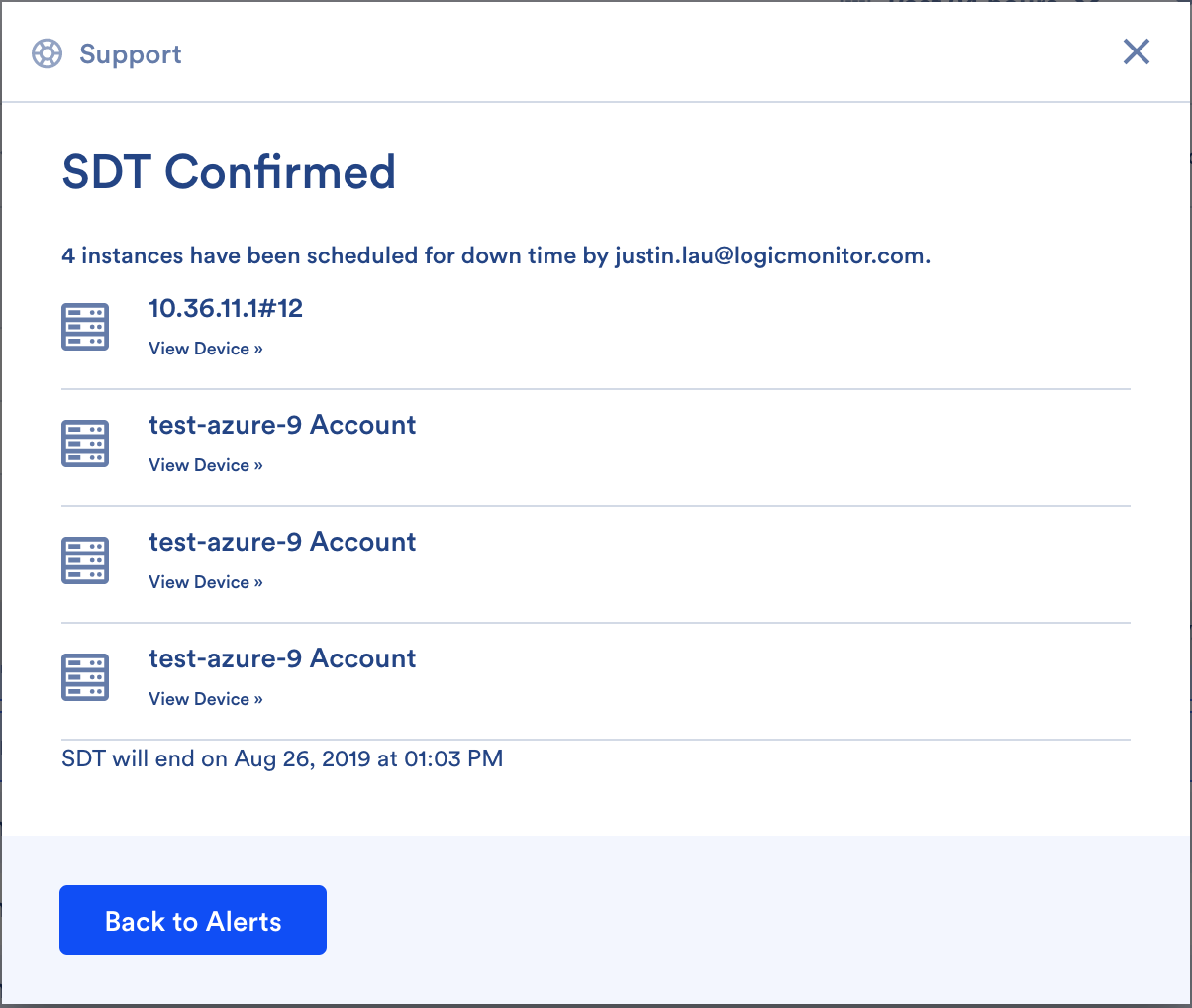
Upon completion of this action, you will see a confirmation dialog reassuring you that this operation has been successful. A list will also be provided that allows you to see and drill-down into all of the resources that were successfully placed into SDT.
This particular improvement aligns with our UX principles, which is to offer more guidance across the product. This is a common UI element you will find in multiple places across the new UI including the new on-boarding workflow and all the ‘add resource’ wizards and at the end of every singular and bulk-action.
Another goal of the UI refresh initiative was to remove all the contrast, inconsistencies, and friction points across the product and really gut the experience to clean it up from the inside out. You’ll notice this across the platform and we believe it’s the small things that really add up to form the larger overall experience of how someone walks away and remembers using a product.
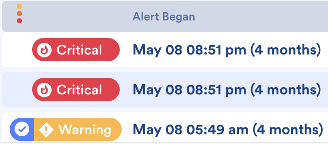
Users will also have the ability to sort the alerts table by multiple columns (using shift + click) on the table column headers, select between an expanded or condensed and light or bold preference for the alert severity icons … and much, much more.
Moving forward, one of the goals outlined in our product vision is to build a truly world class user interface and user experience. The combination of the two tools outlined above (React and Material Design) allows us to build a solid foundation for us to create, deliver, iterate on feedback and repeat. This really is just the first step in a brand new direction and you will continue to see the UI evolve over time.
Want to know more? Join us for a platform demo.
© LogicMonitor 2026 | All rights reserved. | All trademarks, trade names, service marks, and logos referenced herein belong to their respective companies.


