
Data Forecast Visualization
Last updated - 25 July, 2025
The data forecasting feature enables you to predict future trends for your monitored infrastructure by analyzing past performance. It identifies and removes anomalies or missing data from your sample set and then applies a capacity trending algorithm to project future trends.
The data forecast graph visually distinguishes between historical data and projected forecasts by using different background colors. These colors help you to identify whether you are viewing historical data or projected insights. In addition, a vertical date line, labeled “Now,” is displayed on the graph, serving as a clear demarcation between previously collected data and forecasted values.
Note: LogicMonitor does not support alerts based on forecasted data, it can predict when a datapoint exceeds its alert threshold. Specifically, both the Table widget and the Alert Forecast report provide insights into when selected datapoints will trigger alerts. For more information, see Table Widget and Alert Forecast Report.
The following are the benefits of using Data Forecast:
- AIOps-Driven issue diagnosis and mitigation—Helps identify and address potential issues before they escalate
- Alert evaluation—Assists in determining whether an alert is a one-time anomaly, requires immediate action, or will need future attention
- Budget planning and resource forecasting—Provides visibility into the lifecycle and capacity of infrastructure components (For example, SSDs and disks) for better budget allocation
- Optimizes operational and financial planning—Enhances decision-making by forecasting the timeframe and scale of recurring events, enabling more accurate financial and operational strategies
Requirements for Viewing Data Forecast Graphs
To view the data forecasts, you need the following:
- A user with the “Manage” permissions set at the Resource group level
- A user with LogicMonitor Enterprise license
Viewing Data Forecast Graphs
- In LogicMonitor, navigate to Resource Tree> select a required resource> Graphs tab.
Alternatively, you can access the Data Forecast graph from Alerts, Dashboards, or Services. - Select
 and then View Forecast on the top-right corner of the graph.
The data forecast page displays the previously collected data and the forecasted data.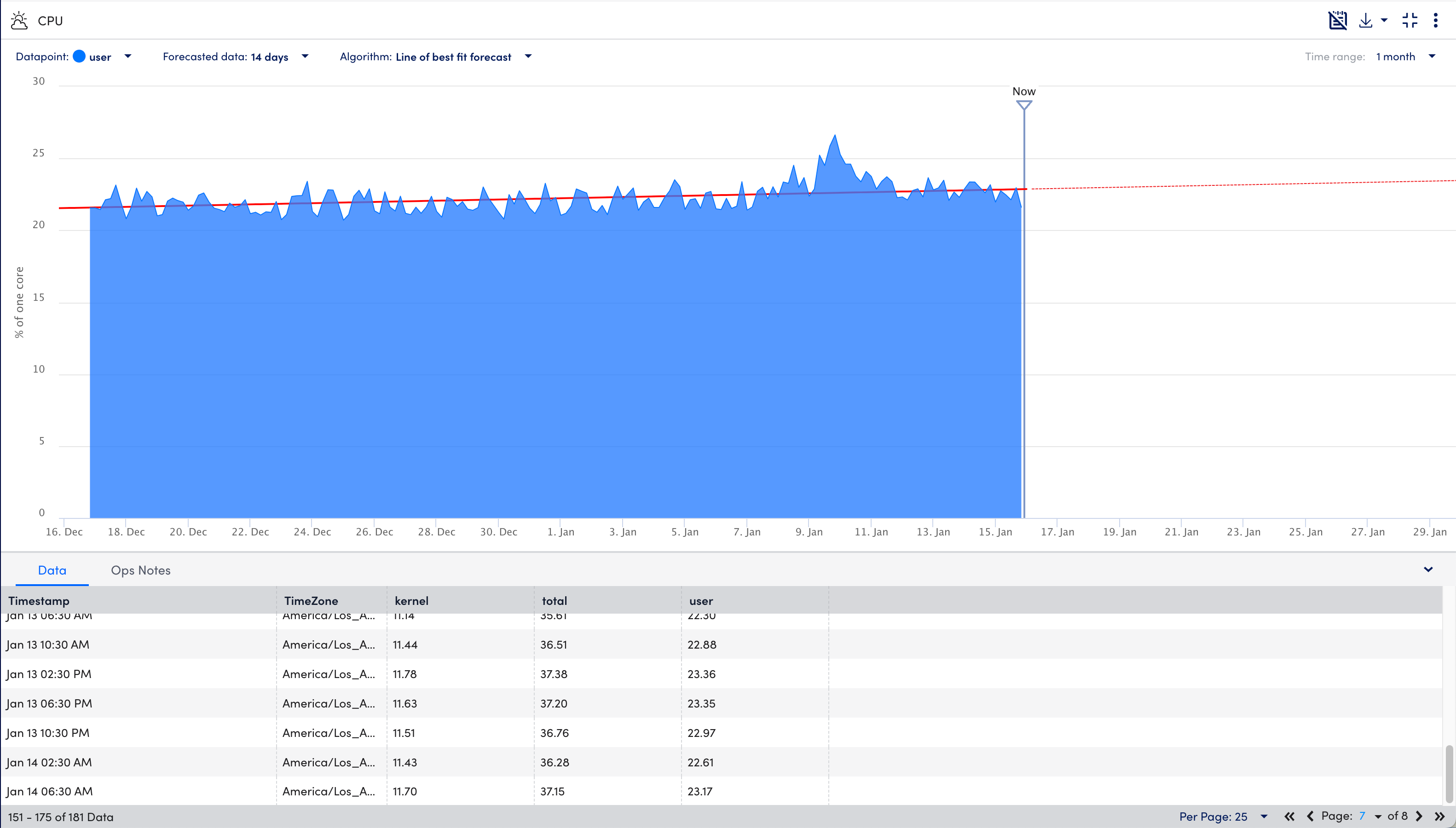
- From the Datapoint dropdown menu, select the required datapoint for which you want to view the data forecast.
Note:
- Forecast graphs can only visualize one datapoint or instance at a time.
- If you access the data forecast from the Alerts page, use the legend selections at the bottom left corner of the window to toggle between datapoints.
- From the Forecasted data dropdown menu, select the duration of the forecast.
- From the Algorithm menu, select one of the following:
- Line of best fit forecast (default)—This method draws a single straight line that best fits forecasted data. This is generally a more useful option if your datapoints are highly variable.
- 95% confidence forecast—This method projects lines that represent forecast values (the middle, thick dashed line), as well as upper and lower confidence bounds. These confidence bounds indicate that LogicMonitor is 95% confident that future datapoint values will fall within this range.
- From the Time range dropdown menu, select a time range for the collected data (training data) that will be used as the basis for the forecast.
- You can view the data (timestamp, timezone) and associated Ops Notes in the details panel at the bottom and do the following:
- Select
 Show Ops Notes to show the associated Ops Notes.
 - Select
 Download and choose in which format either CSV or PDF you want to download the forecast graph data.
 - Select
 Exit fullscreen to stop the view in fullscreen mode.
 - Select to view the more options.
- Select
