
Anomaly Detection Visualization
Last updated - 23 July, 2025
Anomaly detection identifies data that does not conform to expected (or usual) patterns. LogicMonitor uses machine learning algorithms to establish expected data patterns for datapoints to identify data that falls outside of these patterns. Anomaly detection provides another avenue of insight into resource behavior, allowing users to catch issues before they escalate into more severe events potentially.
The LogicMonitor platform leverages anomaly detection to:
- Automatically trigger alerts when anomalous values are present, as discussed in Enabling Dynamic Thresholds for Datapoints.
- Visually highlight expected data ranges (and any data that falls outside of these ranges) for any graph in the LogicMonitor interface, as discussed in this topic.
Requirements for Viewing Anomaly Detection
To view the data forecasts, you need the following:
- A user with the “Manage” permissions set at the Resource group level
- A user with LogicMonitor Enterprise license
Viewing Anomaly Detection on Graphs
You can use anomaly detection to view unusual data patterns, time series graphs with highlighted outliers, alerts for detected anomalies, historical comparisons, individual data points causing anomalies, severity and impact information, and correlations across different metrics or systems.
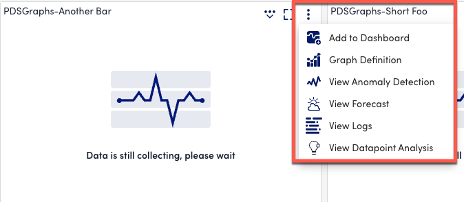
- Select the dropdown arrow in the upper right corner of the graph.
- Select Anomaly Detection from the dropdown menu.
- Review the anomaly detection graph that opens with anomalies highlighted in red.
- Use the legend in the graph window to toggle between datapoints or instances if your graph displays multiple signals.
- Toggle the Expected Range option to shade the area where data point values are expected to fall. This is based on at least 3 days of historical data, and if the graph’s time window exceeds 3 days, the historical window will automatically adjust to match the graph’s time span.
- Enable the Offsets option and choose an offset (24 hours, one week, or 30 days) to add a historical signal for comparison with the current signal.
- Enable the Show Alert Threshold option to overlay static thresholds associated with the datapoint onto the graph.
- Adjust the From and To fields to customize the time range of the anomaly detection graph as needed.
Note: Be aware that anomaly detection graphs are based on aggregated (resampled) data, which may cause slight distortions in the graph coordinates and expected ranges. - Add or view Ops Notes by timestamping annotations to correlate anomalies with other events in your environment.
- If you see the error “Graph line has not enough or valid data,” check the training window for anomaly detection (3 days) and adjust the graph time range to exclude any gaps in data collection.
Recommendation: Ensure there are enough consecutive datapoints in the selected time range to allow the algorithm to generate the expected range for anomaly detection.
